Nuclear power in the U.S.
As seen in The Information’s “Can Tech Get Nuclear Power to Move at AI Speeds?”
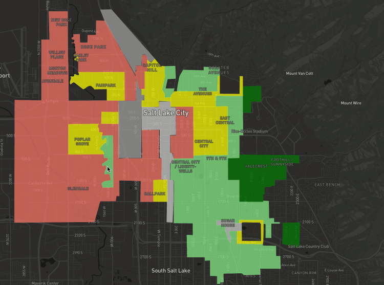
The lasting impacts of redlining on Utah
As seen in the Salt Lake Tribune
A visual investigation with scrollytelling and Mapbox GL JS mapping, exploring how historical housing discrimination continues to shape Utah communities today.
How payments company Deel gets around U.S. sanctions
As seen in The Information’s “The Bitter Fintech Feud That Stretches From Silicon Valley to Moscow”
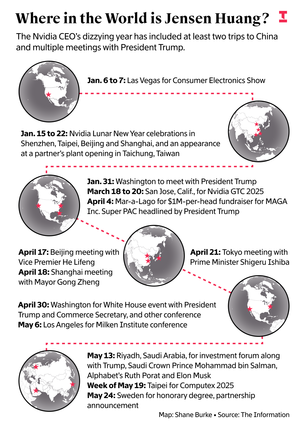
Where in the World is Jensen Huang?
As seen in The Information
This chart accompanied a story on Nvidia CEO Jensen Huang’s increased role as a lobbyist for the company to both the United States and China. Data was compiled from his appearances on photos from wire services like Getty and AP, social media, conference websites and Nvidia materials.
NYC public transit struggles to recover, while car ridership inches towards pre-pandemic levels
From my master’s thesis on transportation in NYC during COVID-19
Daily ridership compared to pre-pandemic baseline (MTA data) and car registrations compared to pre-pandemic (DMV data).
Subway Ridership Compared to Pre-Pandemic Month
Interactive, created with Mapbox GL JS.
Tracking growth from the air in Utah
As seen in the Salt Lake Tribune
An aerial view of rapid development in Utah. Click and drag the white line to reveal changes over time.